8/05/2014

Mystery Stop and My Recent Projects


Day 6

The last day of the Quilters' Bus Trip (I know I am a bit late with this post) was filled with anticipation since every year there is a mystery stop on the trip. We left Cleveland, Ohio, and headed back to Michigan. Not long after crossing the state line we stopped in Dundee (right across the road from the Cabella's where my husband enjoys going) to visit:


This was one of 37 Russell Stover outlet stores in the United States and on the website it tells the features of the store  (and I hope the company does not mind my quoting them):
  • Candy Kitchen - Handmade confections including hand-dipped chocolate covered strawberries, gourmet caramel apples, multiple varieties of nut clusters and more.
  • Baked Goods - Fresh baked cookies from exclusive Russell Stover scratch recipes.
  • Bulk Case - Custom Build a Box of your favorite chocolates by the piece/pound.
  • Fudge - Many flavors of silky handmade fudge made fresh in the store with real butter.
  • Ice Cream - 32 flavors of hand dipped Blue Bell Ice Cream served as cones, cups, sundaes, and milkshakes.
  • Coffee - Fresh gourmet roast coffee.
  • Jelly Belly - 48 flavors of Jelly Belly brand jelly beans.
  • Russell Stover {the store} exclusive flavor boxes that can be found in no other stores.
  • Complete assortment of Russell Stover and Whitman's products including sugar free and Weight Watchers by Whitman's.
  • Buses are always welcome!
I just giggle with their last statement: Buses are always welcome! And oh, my they made us feel welcome. They knew we were stopping and throughout the store they had half pieces of candies for us to sample.  Before lunch! Oh, my they all tasted good. I believe most of us bought something, if not quantities. Just a few ladies were able to resist. And lucky was our last stop. It would have sad to have o urpurchases melt during the main part of the tour. I put my chocolates in plastic bags in the freezer to keep on hand for visitors or special occasions. Do you ever freeze chocolates when they are specially priced for later? 

What I Have Been Working On

During the past few weeks I have been trying to get a little sewing done between some vacation time with family, working at the Gala Gourmet Store and routine housework. 

I have 9 Swoon Blocks to finish and get sent out by the August 20. Here are some of the blocks I have finished. They measure 16" square. Each participant chose the colors desired. It has been fun going through my fabrics to find the colors needed. I posted my own (for testing the pattern) HERE.


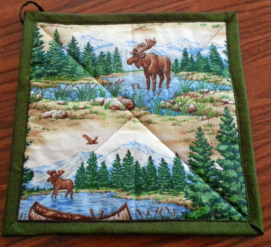
I have made more potholders for sale at Gala Gourmet. The first 9 I brought in sold. The customers like the loop for hanging and the theme prints I am using. 


Row by Row Experience

I am trying to go to some of the local Michigan quilt shops that are participating in the Row by Row Experience. I will take little detours as I travel and pick up the free patterns. Maybe I will find a kit or two to purchase because of the fabrics that I won't find in my stash. 

Are any of you visiting shops that have Row by Rows? If you haven't heard about this national (includes Ontario, Canada, too) event check it out HERE.


8/02/2014

Construction Notes on My Urban Contrast Quilt

I wanted to share a few techniques I used to make this little quilt. 


I printed the photos on EQ Printables Photo Fabric Sheets. I used Regular Cotton (200 thread count). I usually use Cotton Lawn with 240 threads and do like it better as I think it is a softer fabric. But this printed well on my older HP Deskjet F2210. I used the normal print setting. In the past I have not found a difference in the ink quality of the BEST setting and the NORMAL setting. 


I like the backing on the EQ sheets. It is a plastic-type film which peels off so easily. Then the fabric print goes into water to rinse out any extra ink. I have tried other sheets that have a paper backing and some of the papers are a bear to get off. 

I wanted to sash the quilt with a street look. I cut 1-1/4" strips of a black textured fabric and 1" strips of a solid yellow fabric. I sewed the yellow to one black strip and pressed toward the black.


I knew the yellow strip had to be narrow to give somewhat proper proportions. I decided on making it 1/8" wide. I had cut the strip wider than I needed so I could trim it down and get rid of any wiggly edge. I lined up my ruler so that I had the 1/8" of yellow and the 1/4" seam allowance. And my cut was straight because I lined up the seam line on the 3/8" mark on the ruler.


This trimming would make it straight when I sewed on the other black piece.


I had the sashings ready. I cut them a bit longer than the photos so I could trim each step of the way. 


I sewed the bottom two photos and sashing together.


A center sashing was sewn to the two top photos that would be attached to the lower section as you see in the completed quilt. Here is a close-up of the sashing. I am quite pleased with the straightness of the yellow strips.


The outer borders were added.
Before I began quilting, I chose to sew the label on the backing fabric. This is something I want to start doing with all my quilts. (I have heard of quilts that are stolen and labels are removed when they are attached with handstitching.)

To begin, I printed my label on a photo fabric sheet. With the label face down on the backing, I sewed the bottom edge to the backing. I used the water soluble basting tape to turn the side edges and the top edge under. I like this tape since it holds and I don't have to iron and fuss with the seam allowances in places like this. 


I put one extra piece of soluble tape on the top fold to hold the label to the backing so I could stitch it down without using pins. 


And the label is attached. After quilting the entire quilt, I saw that part of the quilting ran through the label. I should have planned the label a bit better to avoid this, but no doubt it is secure.  If anyone removes the label, there will be more work involved than they may want. 


On a large quilt, I don't think I would mind that the quilting goes through the label. Let me know what your thoughts are on labels and security. 


Remember, comment here or you can email me at patchworkbreeze(at)gmail.com

Stop by Monday to see the pincushion that arrived from my swap partner the other day. I will also post some photos of my latest project. 


8/01/2014

Four-In-Art Quilt Group: August Topic Reveal


The time has arrived for the August reveal for our group of quilters. The theme this year was Urban and the topic for this round was Contrast. I am eagerly waiting to see how the others in the group have interepretted the topic. 
I had been taking photos for a few months to see what contrast I could find in the urban environs where I traveled. 
I began thinking of contrast of shapes in buildings. A few things interested me, such as the Rock N Roll Hall of Fame with its many line forms. Ok, it might work well, but not for this round. 


Then I clicked a photo of the Van Andel Institute in Grand Rapids, Michigan, while driving past one day. I liked the wavy lines on the front of the building in contrast to the straight lines of the building and window frames.


I started working on this as my piece and didn't get far -- I just couldn't feel it. I realized I wanted to do something different than another building this time. 


So I went back to listing contrast ideas: colors, shapes, size, texture, building materials, and opposites like old/new, wealthy/poor, light/shadow. I looked through many of my photos from the past few years and I was drawn to texture. I chose many photos that contained sidewalks, walkways, streets and such. I thought I could print the photos after manipulating them a bit in PSE and add texture through the quilting. I decided that the photos would be small enough that I didn't have to add quilting to them. This made sense since my deadline was a little more than a day away! (Planning is the longest part of the process for me.) So which of these to work with?


I knew that in a 12" x 12" piece I could not use all of these photos. So I chose those that reflected contrasting textures and light and dark. These images would be found in an urban area along the streets, perhaps specifically on corners. That helped me along to the next phase of construction--how to join them all together, as my window of time lessened more.  

So, a city street it would be!

Right now I will reveal to you the finished piece, titled: Which Side of the Street? 


I wanted to indicate the street by showing the centerline. I sewed a narrow yellow line of fabric between two wider black textured strips of fabric. The intersection would be a plain black square. I decided that the fabric photo squares were less than 5" either way and would not need quilting. I used EQ Printeables (Regular Cotton sheets) for the prints. (The needle did leave a bit of a hole mark when sewing the street sashing to them, so quilting was, perhaps, not a wise choice.) I quilted a straight line along the outside of all the black sashings and borders.


Tomorrow I will post the construction details of the front and label for those who are interested. Leave me a comment if you would let me know what type of urban contrast pops into your mind. 
If you cannot comment on my blog, send it to: patchworkbreeze(at)gmail.com

Take a few moments to visit the other Four-in-Art Quilters in the group to see how they interpretted the topic of Urban Contrast. 

Carla @Lollyquiltz
Betty @Flickr Site
Leanne @She Can Quilt 
You are visiting Me @ Patchwork Breeze right now!