Showing posts with label Tints and Shades. Show all posts

5/01/2016

Four-in-Art Quilt Challenge Reveal

Four-in-Art is a small group of quilters who hail from many different places. One member announces a yearly quilt theme. This year it's COLOR. A sub-theme was added to each quarter's challenge this year to spice it up. This quarter we had to work MUSIC into our projects. 

Visit the posts of all Four-in-Art members to see how each interpreted Color and Music for this May 1 reveal. Their links are at the bottom of my post. 


I will admit I know just a little about music (to perhaps be dangerous). As a college student studying elementary education I was required to take Music 101, where, in fact, we had to learn to play the piano in 16 one-hour sessions on our own! I was able to play songs written with only quarter notes in the chord of C. Period. 

I know enough about the treble cleff (I like drawing it), "Every Good Boy Does Fine," Do, Re, Me, "F-A-C-E," the counts given to various notes; but, I can't keep time, or rythm and my foot and my fingers don't work together. 


I enjoy listening to a variety of music. As an elementary teacher, I included lots of singing during classes. We had record players and then cassette players. I knew the songs by heart and children are pretty forgiving when the tune maybe not be spot on. I can sing some popular songs and am pretty sure I am flat or sharp where I shouldn't be. 


So where to begin with Color and Music?

Many ideas spun around in my head. I have told group members that I tend to be literal in interpretation on these projects (as I am with most of the quilts I make). 


I thought about a guitar applique after a quilting friend posted about the Gibson Guitar Company in Kalamazoo, Michigan. I even went so far as to draw a guitar in EQ7. 


Another idea was constructing the staff with black and white fabric and uappliqueing the notes in various colors. 


Then!  Out of the blue the idea came to me!

RAIN 

It was a rainy spring day. 

I thought of the song, "It's Raining, It's Pouring," then the Carpenters', "Rainy Days and Mondays," "Raindrops Keep Fallin' on My Head," and Gene Kelly "Singin' in the Rain." 

Well, you get the idea. An internet search indicated there are over 775 songs about rain!


The songs were popping up like mushrooms after a rain. (And that really does happen.)

RAIN would make the music. "Rain Songs" was conceived.
Blue, the color every kid uses to show water (well, there are exceptions). I had a fat quarter pack of fabrics by Anthology ranging from lights to dark (or maybe the other way around). I needed one other fabric because I thought the lightest two would be lost in the layout. I am still learning about tint and shade. I would say that these blues are tints as they get lighter, which would indicate white being added. If black were added I don't think the darkest blue would have the brightness it does. Therefore, shades are not involved in the raindrops.
I applied fusible to the back of 6" x 4" pieces of only 8 of the fabrics. Each color would represent one of the notes on the C scale, or as I remember: Do, Re, Me, Fa, So, La, Ti, Do.

Rain comes during darker weather with grey skies. Five shades of grey would be used to represent the five lines of the staff. I made wavy cuts to indicate the movement of the rain clouds. The different colors show different types of rain, light rain with soft sounds and heavy rain with thunderous downpours. Each raindrop would represent a whole note. The darker the color the lower the note. The lighter the color, the higher the note.

I divided the quilt top into sections. Twelve vertical lines would allow four whole notes to be placed in 3 measures across. 

I drew horizontal lines indicating the lines and spaces of the staff. Each raindrop note would be appliqued to its corresponding place on the staff.

There are actually three Rain Songs on this piece. The rain song on the top is a softer song, higher notes indicated by the lighter blues. The rain is softer, the storm not so strong.

The middle rain song is soft and light to begin then it becomes lower, deeper with the darker or lower notes. High notes to low notes as the grey skies deepen in shade.

The last rain song is a heavy storm, deep grey shades and dark, low notes. The storm lets up a bit, then begins to lower in sound. 

I quilted verticle lines showing the falling rain. The rings indicate the raindrops are hitting the ground, or something, making sound, vibrating outward to our ears. 
 And the back of the quilt with label attached.

The other Four-in-Art Reveals:

We also have a blog, Four-in-Art Quilts, where you can find us all.
Betty         https://www.flickr.com/photos/toot2
Janine         http://www.rainbowhare.com
Simon         http://quiltalicious.blogspot.com
Susan         http://patchworknplay.blogspot.com


6/21/2014

Quilt Designs

I read a blog that talked about a project titled: Quilt Design A Day. You can find information HERE.
I do not remember the original blogger's link to it and am sorry I didn't bookmark it. 

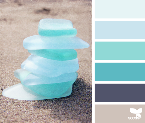
The idea is to design a quilt(s) after looking at the Design Seeds website for that day. The photo has an accompanying color palette to get us designing.

So, last night I tried working with one photo and today I worked on a different photo to designed a quilt. 

The cool thing was that today I discovered another gem in EQ7's tools. I could take an EQ color and find a tint or shade that was closer to the Design Seeds palette. 

Thought I would share what I did. This is the quilt, based on the sea glass photo from Design Seeds.


To start, I resized the window for the Design Seeds photo. Then I resized the EQ7 window and placed them next to each other on the screen. When I resized EQ and clicked the color tool paintbrush, the EQ color palette was separate from the EQ window. This made matching colors much easier.


Do you see how the Design Seeds color palette is on the left and I moved the EQ color palette close to it? I could click through the EQ palette and and see how the colors matched as it moved through the choices. I also learned that if I changed the number of colors EQ showed it sometimes helped me see them better as larger boxes. 

Selecting Tints and Shades


I lessened the number of colors in the EQ palette. I selected one color that I thought was close to the 2nd color from the Design Seeds. I right clicked on that color and got the selection box you see at the right. I highlighted Add Shades & Tints. Then I clicked that selection.

None of the colors really looked close enough to that 2nd color I had chosen on the color palette. But I did notice that the last color looked like the 1st color on the palette so I selected that one. 

After selecting the color (red arrow), I clicked on Add to Sketchbook. The new color is inserted at the end of the EQ Sketchbook color chips and is outlined for us to see. (For illustration purposed, I went back, reclicked the original color I selected so the Add Tint & Shade box would pop up again. You can see it and the new color tint at the bottom right in the EQ color palette. This way didn't have so many photos in the blog.)

Now I can use that color in my quilt design. 

So we are not limited to the smaller selection of colors in the EQ palette. You don't have to go to the block library and try to find other colors. Now if this tool were only available to change the tint or shade of the Fabrics tab colors, just for the sake of designing. 

Have you discovered this tool selection? Are you designing one quilt a day? I think I will try this each day. I may come up with some quilt designs I like. I don't think I have to like each one but I know I am learning as I do this. 

Now, off to finish packing. I am going on a Quilter's Bus Trip to West Virginia this next week and looking forward to it. I will blog when I return. 

Happy Quilting!